“Technique is the language of the artist; develop it tirelessly, to the point of virtuosity. Without it, you will never be able to tell people your dreams, your experiences, the beauty you saw.” (P.P. Chistyakov. Letters, notebooks, memories.)
“Technique is only a means, but an artist who neglects this means will never solve his problem... he will be like a rider who forgot to give his horse oats.” (Roden).
Along with similar statements by masters about the importance of technical skill developed to the point of virtuosity, you will come across warnings not to get carried away with technical techniques as an end in themselves, and especially not to blindly borrow them from your favorite masters.
“Whoever follows others will never overtake them, and whoever does not know how to work properly will never be able to make proper use of other people’s works,” Michelangelo categorically stated. (A. Sidorov. Drawings by old masters.)
The famous Soviet artist and teacher I.P. Krymov seemed to continue this thought, saying: “Many of us try to imitate great masters. They imitate their manner, and manner is the last thing. They often imitate Konstantin Korovin, but they write falsely... It would be better if his imitators tried to repeat his path. Following this path, they perhaps began to write not in Korovin’s way, but in their own way.” (P.P. Krymov - artist and teacher).
Think about these wise sayings and do not look for recipes for mixing paints and mandatory methods for applying strokes.
The very first question that young or adult aspiring artists ask is:
Where to start?
Of course, you need to start with a drawing directly on canvas or cardboard, even better with a small sketch - a sketch on paper with a pencil or charcoal, which can then be transferred to canvas. In a sketch, you have more opportunities to look for an interesting point of view, think through the composition, clarify proportions, etc. You can, however, do this part of the preliminary work directly on canvas or cardboard, and it is better to make the drawing with charcoal, which can be easily brushed off the surface with a piece of rag and thus correct and clarify it. You can draw on the ground with a pencil, but you have to erase it with an eraser, which disturbs the surface of the ground.
The drawing made with charcoal must then be wiped off with a rag so that only a trace of it remains. If the carbon is not shaken off, it will mix with the paint and contaminate it. After brushing off the coal, the barely noticeable pattern can be outlined with thinly diluted blue or brown paint.
And again the question: where to start actually working with paints?The answer can be: from everything at once. This strange answer is easy to explain. It is wrong to start at the top or bottom, right or left, etc. You need to immediately determine the basic relationships of colors in terms of lightness and color tone and let them - for now approximately - outline them, determining at the same time what is the darkest and what is the lightest. This marking, which is usually calledunderpainting, it is recommended to do it with thinly diluted paints.
It is more important for beginners to know that you cannot write a sketch in parts, but need to open it broadly, holistically. You cannot finish a piece of painting, leaving a motley canvas or approximately outlined shades all around.
B.V. Ioganson recommends that beginners paint all over the canvas at once using strokes that are laid out and correlated by color, just as colored pebbles of a mosaic are selected. At the same time, it is necessary to maintain the same degree of elaboration of all parts of the image, to work “from the general to the specific.”
The first experiments should be done on simple still lifes, consisting of two or three objects.
First, you need to paint the entire still life with thinly diluted paints, roughly determine the colors of objects and their lightness ratios, then move on to thicker writing. At the same time, the work must be carried out in its entirety all the time, moving from one subject to another, and not in such a way as to completely finish one part and then proceed to the next. If the work is interrupted for a day or more, then when continuing, the top layer of paint must be removed with a palette knife or soaked in oil, or even better, “Retouch” varnish. A layer of oil paint begins to dry with the formation of a thin film on the surface, which then becomes increasingly thicker and finally dries to the full thickness of the paint layer.
If a new layer is applied to a layer of paint after the film has formed, then when it dries, the paint shrinks and breaks the film of the lower layer. At the same time, the oil from this layer goes to the bottom, and as a result, so-called fades are formed, in which the paint loses its depth of tone, shine and looks dull and sluggish. After completion of work, dullness can be eliminated by soaking these places with oil, but it is necessary to ensure that excess oil does not remain on the surface of the paint layer. If, after a few hours of impregnation, shiny spots remain on the painting (from oil lying on the surface of the paint layer), they should be carefully wiped off with a soft cloth.
If you did not finish the work in one session, then do the subsequent registration on the dried paint layer. Otherwise, withering and blackening of color will appear.
But in cases where no more than 2-3 days have passed between sessions, you can dissolve the resulting film of paint by wiping the sketch with a cut clove of garlic or onion. After this, you can continue to work “raw” without fear of dryness.
Oil paints adhere well to the appropriate primer and make it easy to model, shade and achieve subtle, imperceptible transitions from tone to tone, since they remain wet for a long time, and do not change their original tone when drying. But it would be a mistake to think that oil painting does not need any execution methods and allows you to apply one layer of paint on top of another with impunity without any system. On the contrary, oil painting also requires a very specific execution system. True, defects in the improper use of materials in oil painting are not discovered as quickly as they are observed under the same conditions in other painting techniques, but sooner or later they will inevitably appear.
All normal methods of oil painting come down to two characteristic techniques:
1) Painting in one step “alla prima” (alla prima) - a method in which painting is carried out in such a way that, given the artist’s artistic knowledge of the matter and favorable conditions, the work can be completed in one or several sessions, but before the paints have time to dry. In this case, the color resources of painting are reduced only to those tones that are obtained from the direct mixing of paints on the palette and their illumination on the ground used in the work.
2) Painting in several techniques - a method in which the painter divides his painting task into several techniques, of which each is assigned a special meaning, intentionally with a certain calculation or due to the large size of the work, etc.
In this case, the work is divided into:
- the first registration is the underpainting, in which the painter’s task is reduced to firmly establishing the drawing, general forms and light and shade, while color is either given secondary importance, or it is carried out in such tones that only in further registration with overlying paints give the desired tone or effect,
- for the second, third, etc. registrations, in which the task is reduced to resolving the subtleties of form and color.
This second method makes it possible to use all the resources of oil painting.
You must always follow the basic rules of painting:
1) do not apply oil paints in thick layers in general, and especially paints rich in oil;
2) always use a moderately adhesive (oil) primer in painting, as well as the underpainting and, in general, the underlying layers of painting, saturating them with oil if its content in the latter is insufficient.
The best painting technique for the second registration is “alla prima” painting, which gives freshness to the pictorial execution.
The second registration is carried out with more liquid paints than underpainting. Painting varnishes and condensed oils are applicable here. The latter are introduced into paints in a mixture with turpentine varnishes. The second registration, in terms of the content of binders in its paints, thus exceeds the underpainting. The ancient principle of layering oil paints - “fat on skinny” - is fully observed. However, you should not overuse oils and varnishes here, but rather adhere to a certain moderation.
If the underpainting was carried out in conventional tones, then to make the work easier, it is useful to start the second registration in local tones of nature with glaze or semi-glaze, on top of which you should alreadybody painting .
Corrections in oil painting
Oil paints become more and more transparent over time. This increase in transparency is also observed in body paints, and some of them, like lead white, become translucent due to their loss of hiding power, as well as the thinning of the layer upon drying. Taking into account this feature of oil painting, it is necessary to be very careful about all kinds of correspondence and radical alterations in oil painting, which the painter sometimes needs, since all corrections and notes made with a thin layer of body paints become visible again after a long period of time. .
Thus, in the equestrian portrait of Philip IV by Velasquez, eight legs are visible, four of which protrude from under the tone of the ground, which the author covered them with, apparently being dissatisfied with the position of the legs.
In the portrait of the artist Litovchenko by I. Kramskoy (Tretyakov Gallery), Litovchenko’s forehead can be seen quite clearly through the black hat placed on the artist’s head. on which the hat was put on, apparently, later, when the head was already painted. In Rembrandt's portrait of Jan Sobieski, the stick that Sobieski holds in his hand was initially large in size and then shortened. There can be many such examples.
The above examples clearly show that corrections made in a thin layer, even of opaque paints, in oil painting do not achieve their goal. Here, thorough repeated layers of paint are needed, which alone can make forever invisible those parts of the painting that they want to destroy. It is even better in this case to completely clear the places intended for alteration from painting and then write them down again on clean ground. Using chloroform, acetone and benzene, you can easily and quickly remove even very old oil-based paint.
When making small corrections on important areas (for example, the head, hands of a portrait, etc.), you need to take into account the possible swelling and the usual darkening under the varnish of the corrected areas. And therefore, when starting to correct, the areas to be altered are thoroughly dried, covered with liquid varnish and corrected with paints and painting varnish in order to avoid the appearance of dryness. In the same case, if a fade has formed, it should not be covered with retouching varnish, but the lost shine and tone should be restored to it only by oiling.
Here we present only the most general, elementary information on the technique of oil painting, information with which every novice artist should be familiar. Of course, the oil painting technique is not limited to these brief tips. The artist accumulates knowledge and skills in this area himself in the process of practical work.
Learn other methods of oil painting - underpainting, body molding, glazing techniques as you gain experience. We must go “from simple to complex.”
Page 29 of 59
Various Oil Painting Techniques
Oil paints adhere well to the appropriate primer and make it easy to model, shade and achieve subtle, imperceptible transitions from tone to tone, since they remain wet for a long time, and do not change their original tone when drying.
All the best oil painting techniques were developed during the Renaissance. Knowledge of the properties of the material enabled the old masters to create a style of oil painting that was never surpassed later. In the entire history of oil painting, this style is unique in its harmony between the material and artistic achievements.
Knowledge of painting techniques was preserved in the workshops of painters until the 18th century, but then, with the separation of painting as an art from a craft, under the influence of the emergence of new ideas in it, it was gradually lost.
Already at the first Carracci Academy, the previous technical and artistic education of the painter was replaced by philosophical and artistic education. From this time on, technical knowledge, which in the past was always a support for the painter, seems to be a constraint on artistic freedom.
A particular decline in the technique of oil painting was observed in the era of the French impressionists, who laid the foundation for unsystematic work with oil paints, which was brought to grandiose proportions by their followers (neo-impressionists).
Pointillism has an undoubted meaning from an artistic point of view, but it does not follow from the properties and nature of oil painting; new ideas in art must seek other material for their implementation if they run counter to the old. Thus, from a scientific point of view, impressionism gave birth to a false style of oil painting, which, unfortunately, still has adherents among painters.
Work in the field of painting technique, both by representatives of art and science, at first consisted mainly in the disclosure and revival of lost ancient techniques of oil painting, ignorance of which made it felt so bad in later painting. Much of what was lost was found and revealed, but painting itself at that time went too far from the tasks and principles of ancient painting. Of course, in our time it is not possible to reconcile the techniques of the ancient technique of oil painting with the modern understanding of painting, but the technique of oil painting, whatever its objectives, which claims to create durable works, must follow from the properties and nature of the materials of oil painting.
All normal methods of oil painting come down to two characteristic techniques.
1) Painting in one step " alla prima"(alia prima) - a method in which painting is carried out in such a way that, given the artist’s artistic knowledge of the matter and favorable conditions, the work can be completed in one or several sessions, but before the paints have time to dry. In this case, the color resources of painting are reduced only to those tones that are obtained from the direct mixing of paints on the palette and their illumination on the ground used in the work.
2) Painting in several techniques - a method in which the painter divides his painting task into several techniques, of which each is assigned a special meaning, intentionally with a certain calculation or due to the large size of the work, etc. In this case, the work is divided into the first registration – underpainting, in which the painter’s task is reduced to firmly establishing the drawing, general forms and light and shade. Coloring is either given secondary importance, or it is carried out in such tones that only in further prescriptions with overlying colors give the desired tone or effect - on the second, third, etc. registrations, in which the task is reduced to resolving the subtleties of form and color. This second method makes it possible to use all the resources of oil painting.
Painting "alla prima" (alla prima). In technical terms, this method of painting is the best, since with it the entire painting consists of one layer, the drying of which, with a moderate thickness, proceeds unhindered and quite normally, which is why, with the appropriate soil, it is protected from cracks, just as the paints themselves retain their original freshness. But this method cannot always be implemented in practice and, moreover, it is not always part of the painter’s task.
The primer for painting “alla prima” should not be too sticky, nor too impermeable and slippery, therefore, when using adhesive primer, all necessary measures are taken to prevent too noticeable changes in the color of the paint due to loss of oil. Oily soil, especially one that has dried thoroughly and is therefore impenetrable, is given some permeability, which is achieved by rubbing it with alcohol or pumice; In addition, choose soil with a rough surface. As for the color of the soil, the most suitable in this case are light soils with various shades, in accordance with the pictorial task, as well as pure white soil. Pinkish, yellowish and other shades of primer are obtained by painting the white primer with transparent paint.
The painting method described often does not require conventional drawing, and the artist can directly proceed to paint and writing, depending on the painting task and the experience of the artist.
If a drawing is necessary, then it can be limited to a light charcoal sketch. Black charcoal drawing with its fixer should be avoided, since any sharp black contours will subsequently show through a thin layer of paint and thus spoil the painting. The composition of the fixative is also important for its strength.
To be able to finish the painting “raw”, i.e. Before the oil paints begin to dry, all sorts of measures are taken, but harmless to painting, starting with the selection of paints. Slow-drying paints are preferred here.
In order to delay the drying of paints as long as possible, the painting being executed is placed in the cold, in the dark, in the intervals between work, and, if possible, free access to air is blocked. The implementation of these last measures, unfortunately, cannot always be used, especially with large sizes of the painting, however, these measures are very effective.
Essential oils are used for the same purpose.
Painting with this method is carried out differently and depends largely on the individuality of the artist; That is why, when presenting this method, we can limit ourselves to only the most essential and important instructions.
By painting “alla prima”, in the literal sense of these words, one must mean one of the methods in which the artist sets himself the task of immediately reproducing in paint everything that he sees in nature, i.e. color, shape, light and shade, etc., without resorting to dividing this complex task into individual moments of work. The difficulty of solving this problem is, of course, great, and becomes even greater if the artist strives to finish his work “raw,” i.e. before the paints dry.
Painting is done in different ways. It can be started with strokes of semi-thick paints, applied freely, tone by tone, without stirring them for a long time on the palette, until the entire canvas is revealed.
Painting should be done with tube paints.
When applying too thick a layer of paint, which makes further work difficult, you should remove the excess using a palette knife, spatula and knife, as well as placing clean paper on the layer of paint, which is pressed with the palm of your hand against it and then, after removal, takes on all the excess paint .
When painting “alla prima”, you can start rubbing it, thinning the paints with skippy and applying them liquidly, like watercolors. This laying is carried out planarly, without modeling forms, with the goal only of a broad overall effect. For it, it is better to use body paints, introducing white into them. Then, in further work, impasto paints are introduced, and real painting begins.
When working “alla prima” on too tacky ground, oil paints produce a matte painting, which in terms of color is inferior to tempera and, in addition, if the paints are de-oiled too much, they lack strength.
Painting performed “alla prima” has a unique beauty; it is pleasant in its freshness and spontaneity, revealing the author’s “brushstroke” and his temperament. Examples of this type of painting can serve as I. Repin’s sketches for his painting “The State Council”.
Painting in several stages. This kind of painting is called multi-layered.
Techniques multilayer painting are different. It can be carried out from beginning to end with oil or oil-varnish paints, as well as a mixed method of painting, the beginning of which is given with water paints, and the end with oil and oil-varnish.
Depending on the painting method chosen by the artist, the canvas primer used is also selected.
The drawing from which the work begins is made with different materials, depending on the color of the primer, its composition and methods of pictorial underpainting. As stated above, it is best to do it separately on paper and then transfer it to canvas, where it is outlined over an adhesive or emulsion primer with watercolor and tempera and thinly diluted oil paint, which dries quickly on the oil primer.
With this approach to the matter, the soil retains the purity of its color, in addition, its surface, which may suffer when corrections and changes are made in the drawing with charcoal, pencils, etc.
Then comes the underpainting, the technical side of which should perhaps better suit its purpose.
Underpainting. Since the underpainting in a painting is the first layer of painting, which must then take over subsequent layers, then, in the interests of the strength of the painting, it should be done in such a way that it makes it possible, with full guarantee of the strength of the work, to proceed with further registrations in a short time .
The most appropriate technique for this task will be water paints: watercolor and tempera.
Underpainting with water paints is done only on emulsion primer, on which both watercolor and tempera paint work quite well. This primer should contain a significantly smaller amount of oil than an emulsion primer for oil painting.
Watercolor, however, is only suitable for small works; In addition, the tone of watercolor paints under varnish is not similar to the tone of oil paints. This is why watercolor underpainting requires a full coverage of it with oil paints.
Tempera painting should be considered the most applicable in underpainting. It is especially appropriate when performing large-sized works. Here, of course, only tempera of the highest qualities can be used, i.e. casein or egg tempera.
Tempera underpainting gives greater strength to paints, which become so intense under varnish that the oil paint that finishes the painting can give up in terms of color intensity in front of them. This circumstance must be taken into account when performing underpainting. In this case, the best material for underpainting would be oil-varnish paints.
Tempera underpainting is done with body and transparent liquid paints, but always in a thin layer without any paste.
Underpainting with oil paints, both technically and pictorially, is done in different ways.
Carrying out painting using this method on adhesive and semi-adhesive primers is the most appropriate, since with the use of the latter the number of oil layers decreases, which has a very favorable effect on the strength of the painting, but impeccably prepared oil primers can also be used.
One of the frequently used and quite productive ways of painting in underpainting is to do it “as a rub” with oil paints, diluted essential oils, turpentine, oil, etc., which is also practiced in “alla prima” painting.
A thin, as if watercolor layer of paints establishes the forms, the general coloring of the picture and its entire ensemble.
Drying of the underpainting made by this method is very fast if the paints are fast-drying, and, moreover, through, due to the thinness of the paint layer, which, of course, is of great importance for further work on the painting.
But you can also do underpainting with impasto painting, and the technique will depend entirely on the properties of the soil used.
Paints are applied to the adhesive pulling primer in the form in which they come from tubes, without any thinners.
The positive properties of this underpainting are that its paints dry quickly and bind firmly to the ground. The disadvantage is the change in the tone of the paints during the painting process, as well as when wiping the underpainting with varnish before further registration.
The old masters, especially those more distant from us, looked at their work in the underpainting as a preparatory rough work, where all the attention of the master was absorbed in the setting of the drawing, modeling of forms, and details of the composition; As for the coloring, only the necessary base was prepared for it in the underpainting, based on which the color of the picture was subsequently created, the freshness of which is largely explained by the method of work described above.
Modern painting adheres, in general terms, to the same system of work, but the “alla prima” method of painting has received very great importance in it. Each era, as we see, creates its own system of painting, which, of course, cannot be ignored.
Underpainting in a pictorial sense should be carried out in such a way as to simplify, if possible, all further registrations. A correctly executed underpainting is therefore easy to finish with a small load of paints during the second registration.
An underpainting made with tempera will be ready for registration earlier than other underpaintings. Then, in order of readiness, come oil underpaintings on adhesive primers and, finally, impasto oil paints on emulsion and oil primers. A well-dried painting can be recognized by the following characteristics: it does not stick; when scraped with a fingernail and a knife, it turns into powder, but not into shavings; It doesn't fog up when you breathe.
If necessary, the underpainting can be well scraped and smoothed with a knife, special scraper, etc., before re-painting.
Scraping, pumice and smoothing layers of oil painting is especially appropriate when underpainting with impasto (greasy) layers of paint, since here excess roughness is cut off and, what is especially important, the top crust of dried oil is removed, which, when the oil paint dries strongly, prevents the attachment of the layers applied on top of it oil paints. After this operation, the underpainting is washed with clean water and dried.
If the underpainting is not impasto, there is no need to scrape it. In order for the dried layer of oil paint to regain the ability to accept paint, if it has not been scraped and sanded, it is wiped with bleached oil, which is rubbed into it with the palm of the hand. The oil is applied in the smallest amount, just to moisten the surface that is supposed to be painted again.
Instead of oil, the underpainting can be coated with a warm liquid solution of Venetian turpentine (balsam) in turpentine, as was practiced in the old days, or with a liquid solution of turpentine varnish, since essential oils easily moisten dried oil paint. The same goal is achieved by adding painting varnishes containing essential oils to paints.
If the rules for handling the underpainting are not followed, the upper layers of the painting become prone to crumbling, and the more so, the longer the underpainting is left in place; There are many examples of this in the works of painting of a later era.
When further painting the underpainting, glazes can be introduced if they were part of the painting execution plan, or secondary painting is carried out in the so-called “half-letter”, i.e. with a thin layer of body paint, and the painting ends with this technique. It must be borne in mind, however, that too much build-up of colors in oil painting is considered unacceptable; Each newly applied layer must be dried, and only then can further work begin.
Basic Rules:
1) do not apply oil paints in thick layers in general, and especially paints rich in oil;
2) always use a moderately adhesive (oil) primer in painting, as well as the underpainting and, in general, the underlying layers of painting, saturating them with oil if its content in the latter is insufficient.
The best painting technique for the second registration is “alla prima” painting, which gives freshness to the pictorial execution.
The second registration is carried out with more liquid paints than underpainting. Painting varnishes and condensed oils are applicable here. The latter are introduced into paints in a mixture with turpentine varnishes. The second registration, in terms of the content of binders in its paints, thus exceeds the underpainting. The ancient principle of layering oil paints - “fat on skinny” - is fully observed.
If the underpainting was carried out in conventional tones, then to make the work easier, it is useful to start the second registration in local tones of nature with glaze or semi-glaze, on top of which body painting follows.
Glazing. Glazes are thin, transparent and translucent layers of oil and other paints applied to other well-dried similar paints to give the latter the desired intense and transparent tone.
Almost all paints are suitable for glazing: some are transparent, others are semi-transparent. Less suitable ones include cadmium, cinnabar, Neapolitan yellow, English red, kaput-mortuum, black cork and peach and some others.
Transparent glazes only change the tone of the underlying preparation into a thicker and more transparent one, without affecting the detail of the modeling and the main light and shade. Translucent ones can significantly change, depending on the degree of their transparency, the detail of the underpainting modeling.
Glazing can be used to complement or complete almost any painting that has been started in one way or another, but even better results are achieved with underpainting specially prepared for this purpose. In this case, the underpainting is done in such a way that the painting is lighter and colder than it is supposed to be in its finished form; the proper tone and chiaroscuro give it glazes in combination with the tones of the underpainting.
Glazing was of great importance to the old masters. Titian, Rembrandt, Velasquez, their contemporaries and other masters of earlier times made excellent use of them in their painting. The popularity of glazes in past eras indicates that they perfectly met the pictorial needs of the artists who used them.
Glazes, due to their physical structure, strongly absorb light, and therefore a painting made with them requires much more light for its illumination than a painting painted in body paints, which reflect light more than they absorb.
For the same reason, painting done with glazes is devoid of airiness, which is best achieved in painting with paints with a matte surface that strongly reflects and scatters light.
The tones produced by glazing come forward rather than receding back. Therefore, the sky in the painting is not painted with glazes.
Of great interest to the artist of our time are semi-glazes applied in translucent tones.
Semi-glaze is paint applied in a thin translucent layer. From an optical point of view, such a layer of paint is one of the types of so-called “turbid media”, which are responsible for some of the visible colors of nature. The tones obtained in painting using semi-glazes have a unique beauty. They do not shine with strength and brightness, but it is not possible to obtain them by physically mixing colors on a palette. The old masters of the later era made extensive use of the described painting method; Contemporary artists also use it, often accidentally or unconsciously.
Corrections. Oil paints become more and more transparent over time. This increase in transparency is also observed in body paints, and some of them, like lead white, become translucent due to their loss of hiding power, as well as the thinning of the layer upon drying. Taking into account this feature of oil painting, it is necessary to be very careful about all kinds of correspondence and radical alterations in oil painting, which the painter sometimes needs, since all corrections and notes made with a thin layer of body paints, after a long period of time, become again visible.
Thus, in the equestrian portrait of Philip IV by Velasquez, eight legs are visible (Madrid gallery), of which four protrude from under the tone of the ground, which the author covered them with, apparently being dissatisfied with the position of the legs.
In the portrait of the artist Litovchenko by I. Kramskoy (Tretyakov Gallery), through the black hat placed on the artist’s head, Litovchenko’s forehead can be seen quite clearly, on which the hat was placed, apparently, later, when the head was already painted. In Rembrandt's portrait of Jan Sobieski, the stick that Sobieski holds in his hand was initially large in size and then shortened. There can be many such examples.
The above examples clearly show that corrections made in a thin layer, even of opaque paints, in oil painting do not achieve their goal. Here, thorough repeated layers of paint are needed, which alone can make forever invisible those parts of the painting that they want to destroy. It is even better in this case to completely clear the areas intended for alteration from painting and then write them down again on clean ground. Using chloroform, acetone and benzene, you can easily and quickly remove even very old oil-based paint.
When making small corrections on important places (for example, the head, hands of a portrait, etc.), you need to take into account the possible swelling and the usual darkening under the varnish of the corrected places. And therefore, when starting to correct, the areas to be altered are thoroughly dried, covered with liquid varnish and corrected with paints and painting varnish in order to avoid the appearance of dryness. In the same case, if a fade has formed, it should not be covered with retouching varnish, but the lost shine and tone should be restored to it only by oiling.
| Material index |
|---|
| Course: Painting Techniques |
| DIDACTIC PLAN |
| Introduction |
| General information about paints |
Composition has its own laws that develop in the process of artistic practice and the development of theory. This question is very complex and extensive, so here we will talk about the rules, techniques and means that help build a plot composition, translate an idea into the form of a work of art, that is, about the laws of composition construction.
We will consider mainly those that relate to the process of creating a realistic work. Realistic art does not simply reflect reality, but embodies the artist’s delight in the amazing beauty of ordinary things - the aesthetic discovery of the world.
Of course, no rules can replace the lack of artistic abilities and creative talent. Talented artists can intuitively find the right compositional solutions, but to develop compositional talent it is necessary to study theory and work hard on its practical implementation.
The composition is built according to certain laws. Its rules and techniques are interconnected and apply at all moments of work on the composition. Everything is aimed at achieving expressiveness and integrity of the work of art.
The search for an original compositional solution, the use of means of artistic expression that are most suitable for realizing the artist’s plan, form the basis of the expressiveness of the composition.
So, let's look at the basic principles of constructing a work of art, which can be called rules, techniques and means of composition.
The main idea of the composition can be built on the contrasts of good and evil, cheerful and sad, new and old, calm and dynamic, etc.
Contrast as a universal tool helps create a bright and expressive work. Leonardo da Vinci in his Treatise on Painting spoke about the need to use contrasts of sizes (high with low, large with small, thick with thin), textures, materials, volume, plane, etc.
Tonal and color contrasts are used in the process of creating works of graphics and painting of any genre.

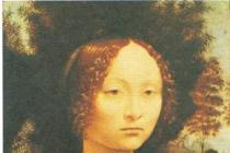
35. LEONARDO DA VINCI. Portrait of Ginevra de Benci
A light object is better visible and more expressive against a dark background and, conversely, a dark object against a light one.
In V. Serov’s painting “Girl with Peaches” (ill. 36) you can clearly see that the girl’s dark face stands out as a dark spot against the background of the light window. And although the girl’s pose is calm, everything in her appearance is infinitely alive, it seems that she is about to smile, shift her gaze, and move. When a person is depicted in a typical moment of his behavior, capable of movement, not frozen, we admire such a portrait.

36. V. SEROV. Girl with peaches
An example of the use of contrasts in a multi-figure thematic composition is K. Bryullov’s painting “The Last Day of Pompeii” (ill. 37). It depicts the tragic moment of death during a volcanic eruption. The composition of this painting is built on the rhythm of light and dark spots, various contrasts. The main groups of figures are located on the second spatial plan. They are highlighted by the strongest light from the lightning flash and therefore have the most contrast. The figures of this plane are especially dynamic and expressive, and are distinguished by subtle psychological characteristics. Panic fear, horror, despair and madness - all this was reflected in people’s behavior, their postures, gestures, actions, faces.

37. K. BRYULLOV. The last day of Pompeii
To achieve the integrity of the composition, you should highlight the center of attention where the main thing will be located, abandon secondary details, and mute contrasts that distract from the main thing. Compositional integrity can be achieved by combining all parts of the work with light, tone or color.
An important role in the composition is given to the background or environment in which the action takes place. The environment of the characters is of great importance for revealing the content of the picture. The unity of impression and the integrity of the composition can be achieved if you find the necessary means to realize the plan, including the most typical interior or landscape.
So, the integrity of the composition depends on the artist’s ability to subordinate the secondary to the main thing, on the connections of all elements with each other. That is, it is unacceptable for something minor in the composition to immediately catch the eye, while the most important remains unnoticed. Every detail should be perceived as necessary, adding something new to the development of the author's plan.
Remember:
– no part of the composition can be removed or replaced without damage to the whole;
– parts cannot be interchanged without damage to the whole;
– no new element can be added to the composition without damaging the whole.
Knowing the principles of composition will help you make your drawings more expressive, but this knowledge is not an end in itself, but only a means to help achieve success. Sometimes a deliberate violation of compositional rules becomes a creative success if it helps the artist more accurately realize his plan, that is, there are exceptions to the rules. For example, it can be considered mandatory that in a portrait, if the head or figure is turned to the right, it is necessary to leave free space in front of it so that the person being portrayed, relatively speaking, has somewhere to look. And, conversely, if the head is turned to the left, then it is shifted to the right of the center.
V. Serov in his portrait of Ermolova breaks this rule, which achieves a striking effect - it seems that the great actress is addressing the audience who are outside the frame of the picture. The integrity of the composition is achieved by the fact that the silhouette of the figure is balanced by the train of the dress and the mirror (ill. 38).

38. V. SEROV. Portrait of Ermolova
The following compositional rules can be distinguished: transmission of motion (dynamics), rest (statics), golden ratio (one third).
Composition techniques include: conveying rhythm, symmetry and asymmetry, balancing parts of the composition and highlighting the plot and compositional center.
Composition means include: format, space, compositional center, balance, rhythm, contrast, chiaroscuro, color, decorativeness, dynamics and statics, symmetry and asymmetry, openness and closedness, integrity. Thus, the means of composition are everything that is necessary to create it, including its techniques and rules. They are diverse, otherwise they can be called means of artistic expressiveness of the composition. Not all are named here, but only the main ones.
Transmission of rhythm, movement and rest
Rhythm is a universal natural property. It is present in many phenomena of reality. Remember examples from the world of living nature that are in one way or another connected with rhythm (cosmic phenomena, rotation of planets, change of day and night, cyclical seasons, growth of plants and minerals, etc.). Rhythm always implies movement.
Rhythm in life and in art are not the same thing. In art there are possible interruptions in rhythm, rhythmic accents, its unevenness, not mathematical precision, as in technology, but living diversity, finding an appropriate plastic solution.
In works of fine art, as in music, one can distinguish between an active, impetuous, fractional rhythm or a smooth, calm, slow one.
Rhythm is the alternation of any elements in a certain sequence.
In painting, graphics, sculpture, and decorative arts, rhythm is present as one of the most important expressive means of composition, participating not only in the construction of the image, but also often imparting a certain emotionality to the content.

39. Ancient Greek painting. Hercules and Triton surrounded by dancing Nereids
Rhythm can be set by lines, spots of light and shadow, spots of color. You can use alternation of identical elements of the composition, for example, figures of people, their arms or legs (Fig. 39). As a result, rhythm can be built on contrasts of volumes. A special role is given to rhythm in works of folk and decorative art. All numerous compositions of various ornaments are built on a certain rhythmic alternation of their elements.
Rhythm is one of the “magic wands” with which you can convey movement on a plane (Fig. 40).

40. A. RYLOV. In the blue expanse
We live in a constantly changing world. In works of fine art, artists strive to depict the passage of time. Movement in a painting is an expression of time. On a painting, fresco, in graphic sheets and illustrations, we usually perceive movement in connection with the plot situation. The depth of phenomena and human characters is most clearly manifested in concrete action, in movement. Even in genres such as portrait, landscape or still life, true artists strive not just to capture, but to fill the image with dynamics, to express its essence in action, over a certain period of time, or even to imagine the future. The dynamism of the plot can be associated not only with the movement of some objects, but also with their internal state.

41. Rhythm and movement
Works of art that contain movement are characterized as dynamic.
Why does rhythm convey movement? This is due to the peculiarity of our vision. The gaze, moving from one pictorial element to another, similar to it, itself, as it were, participates in the movement. For example, when we look at waves, moving our gaze from one wave to another, the illusion of their movement is created.
Fine art belongs to the group of spatial arts, in contrast to music and literature, in which the main thing is the development of action in time. Naturally, when we talk about the transfer of motion on a plane, we mean its illusion.
What other means can be used to convey the dynamics of the plot? Artists know many secrets to create the illusion of movement of objects in a picture and emphasize its character. Let's look at some of these tools.
Let's do a simple experiment with a small ball and a book (Fig. 42).

42. Ball and book: a – the ball lies calmly on the book,
b – slow movement of the ball,
c – rapid movement of the ball,
d - the ball rolled away
If you tilt the book a little, the ball starts to roll. The greater the tilt of the book, the faster the ball slides along it; its movement becomes especially fast at the very edge of the book.
Why is this happening? Anyone can do this simple experiment and, based on it, be convinced that the speed of the ball depends on the amount of tilt of the book. If you try to depict this, then in the drawing the slope of the book is a diagonal with respect to its edges.
Motion transfer rule:
– if one or more diagonal lines are used in the picture, the image will seem more dynamic (Fig. 43);
– the effect of movement can be created if you leave free space in front of a moving object (Fig. 44);
– to convey the movement, you should choose a certain moment of it, which most clearly reflects the nature of the movement and is its culmination.

43. V. SEROV. The Kidnapping of Europa

44. N. ROERICH. Overseas guests
In addition, the image will appear to be moving if its parts recreate not just one moment of movement, but its successive phases. Pay attention to the hands and poses of the mourners on the ancient Egyptian relief. Each of the figures is frozen in a certain position, but when viewing the composition in a circle, one can see consistent movement (Fig. 45).
Movement becomes understandable only when we consider the work as a whole, and not individual moments of movement. Free space in front of a moving object makes it possible to mentally continue the movement, as if inviting us to move with it (ill. 46a, 47).

45. Mourners. Relief from a tomb in Memphis
In another case, it seems that the horse has stopped at full speed. The edge of the sheet does not give him the opportunity to continue moving (ill. 466, 48).

46. Examples of motion transmission

47. A. BENOIS. Illustration for A. Pushkin’s poem “The Bronze Horseman”. Ink, watercolor

48. P. PICASSO. Toro and bullfighters. Mascara
You can emphasize movement by using the direction of the drawing lines. In V. Goryaev’s illustration, all the lines rushed deeper into the street. They not only build a perspective space, but also show movement deeper into the street, into the third dimension (ill. 49).
In the sculpture “Discobolus” (Fig. 50), the artist depicted the hero at the moment of the highest tension of his powers. We know what happened before and what will happen next.

49. V. GORYAEV. Illustration for N. Gogol’s poem “Dead Souls”. Pencil

50. MIRON. Discus thrower
A sense of movement can be achieved by using a blurred background, unclear, indistinct contours of objects in the background (Fig. 51).

51. E. MOISEENKO. Messengers
A large number of vertical or horizontal background lines can slow down movement (Fig. 52a, 526). Changing the direction of movement can speed it up or slow it down (ill. 52c, 52d).
The peculiarity of our vision is that we read text from left to right, and movement from left to right is easier to perceive, it seems faster.
Rest transfer rule:
– if there are no diagonal directions in the picture;
– if there is no free space in front of the moving object (see Fig. 466);
– if objects are depicted in calm (static) poses, there is no culmination of action (ill. 53);
– if the composition is symmetrical, balanced or forms simple geometric patterns (triangle, circle, oval, square, rectangle), then it is considered static (see Fig. 4-9).

52. Motion transmission schemes

53. K. MALEVICH. In the hayfield

54. K. KOROVIN. in winter
A feeling of peace can arise in a work of art under a number of other conditions. For example, in K. Korovin’s painting “In Winter” (ill. 54), despite the fact that there are diagonal directions, the sleigh with a horse stands calmly, there is no sense of movement for the following reasons: the geometric and compositional centers of the picture coincide, the composition is balanced, and the free space in front of the horse is blocked by a tree.
Identification of the plot and compositional center
When creating a composition, you need to take care of what will be the main thing in the picture and how to highlight this main thing, that is, the plot-compositional center, which is often also called the “semantic center” or “visual center” of the picture.
Of course, not everything in a plot is equally important, and minor parts are subordinate to the main thing. The center of the composition includes the plot, the main action and the main characters. The compositional center should, first of all, attract attention. The center is highlighted by illumination, color, image enlargement, contrasts and other means.
Not only in works of painting, but also in graphics, sculpture, decorative arts, and architecture, a compositional center is distinguished. For example, Renaissance masters preferred that the compositional center coincide with the center of the canvas. By placing the main characters in this way, the artists wanted to emphasize their important role and significance for the plot (ill. 55).

55. S. BOTTICELLI. Spring
Artists have come up with many options for the compositional construction of a painting, when the center of the composition is shifted in any direction from the geometric center of the canvas, if the plot of the work requires it. This technique is good to use to convey movement, the dynamics of events, and the rapid development of the plot, as in V. Surikov’s painting “Boyaryna Morozova” (see ill. 3).
Rembrandt's painting “The Return of the Prodigal Son” is a classic example of a composition where the main thing is strongly shifted from the center to most accurately reveal the main idea of the work (ill. 56). The plot of Rembrandt's painting is inspired by a gospel parable. On the threshold of their home, a father and son met, who had returned after wandering around the world.

56. REMBRANDT. Return of the Prodigal Son
Painting the rags of a wanderer, Rembrandt shows the difficult path his son has traveled, as if telling it in words. You can look at this back for a long time, sympathizing with the suffering of the lost. The depth of space is conveyed by a consistent weakening of light and shadow and color contrasts, starting from the foreground. In fact, it is built by the figures of witnesses to the scene of forgiveness, gradually dissolving into the twilight.
The blind father put his hands on his son's shoulders as a sign of forgiveness. This gesture contains all the wisdom of life, pain and longing for the years lived in anxiety and forgiveness. Rembrandt highlights the main thing in the picture with light, focusing our attention on it. The compositional center is located almost at the edge of the picture. The artist balances the composition with the figure of his eldest son standing on the right. The placement of the main semantic center at one third of the distance in height corresponds to the law of the golden ratio, which has been used by artists since ancient times to achieve the greatest expressiveness of their creations.
Rule of the golden ratio (one third): The most important element of the image is located in accordance with the proportion of the golden ratio, that is, approximately 1/3 of the whole.

57. Compositional scheme of the painting
Artists use paintings with two or more compositional centers to show several events occurring simultaneously and of equal importance.
Let's look at Velazquez's painting "Las Meninas" and its diagram (ill. 58-59). One compositional center of the picture is the young infanta. The ladies-in-waiting, the meninas, leaned towards her on both sides. In the geometric center of the canvas there are two spots of the same shape and the same size, but contrasting with each other. They are opposites, like day and night. Both of them - one white, the other black - are exits to the outside world. This is another compositional center of the picture.
One way out is a real door to the outside world, the light given to us by the sun. The other is a mirror in which the royal couple is reflected. This exit can be perceived as an exit into another world - secular society. The contrast between the light and dark principles in the picture can be perceived as a dispute between the ruler and the artist, or, perhaps, the opposition of art - vanity, spiritual independence - servility.
Of course, the bright beginning is represented in the painting in full growth - by the figure of the artist, he is completely dissolved in creativity. This is a self-portrait of Velazquez. But behind him, in the eyes of the king, in the dark figure of the marshal in the doorway, oppressive dark forces are felt.

58. Diagram of Velazquez’s painting “Las Meninas”

59. VELASQUEZ. Meninas
The group of persons depicted by the artist is numerous enough for the imaginative viewer to get any number of pairs related by similarity or contrast: artist and king, courtiers and elite, beauty and ugliness, child and parents, people and animals.
In one picture, several ways to highlight the main thing can be used at once. For example, using the technique of “isolation” - depicting the main thing in isolation from other objects, highlighting it in size and color - you can achieve the construction of an original composition.
It is important that all techniques for highlighting the plot and compositional center are used not formally, but to best reveal the artist’s intentions and the content of the work.

60. DAVID. Oath of the Horatii
Transferring symmetry and asymmetry in a composition
Artists of different eras used a symmetrical construction of the picture. Many ancient mosaics were symmetrical. Renaissance painters often built their compositions according to the laws of symmetry. This construction allows us to achieve the impression of peace, majesty, special solemnity and significance of events (ill. 61).

61. RAFAEL. Sistine Madonna
In a symmetrical composition, people or objects are located almost mirror-like with respect to the central axis of the picture (Fig. 62).

62. F. HODLER. Lake Tan
Symmetry in art is based on reality, which is replete with symmetrically arranged forms. For example, a human figure, a butterfly, a snowflake and much more are arranged symmetrically. Symmetrical compositions are static (stable), the left and right halves are balanced.

63. V. VASNETSOV. Bogatyrs
In an asymmetrical composition, the arrangement of objects can be very diverse depending on the plot and design of the work; the left and right halves are unbalanced (see Fig. 1).


64-65 a. Symmetrical composition, b. Asymmetrical composition
The composition of a still life or landscape is easy to imagine in the form of a diagram, which clearly shows whether the composition is symmetrical or asymmetrical.


Transferring balance in a composition
In a symmetrical composition, all its parts are balanced; an asymmetrical composition can be balanced or unbalanced. A large light spot can be balanced with a small dark one. Many small spots can be balanced by one large one. There are many options: parts are balanced by weight, tone and color. Balance can concern both the figures themselves and the spaces between them. With the help of special exercises, it is possible to develop a sense of balance in a composition, learn to balance large and small quantities, light and dark, various silhouettes and color spots. Here it will be useful to remember your experience of finding balance on a swing. Everyone can easily figure out that one teenager can be balanced by placing two kids at the other end of the swing. And the baby can even ride with an adult who will sit not on the edge of the swing, but closer to the center. The same experiment can be done with scales. Such comparisons help to balance different parts of the picture in size, tone and color to achieve harmony, that is, to find balance in the composition (ill. 66, 67).


In an asymmetrical composition, sometimes there is no balance at all if the semantic center is closer to the edge of the picture.
Look how the impression of the drawing (ill. 68) changed when we saw its mirror image! This property of our vision must also be taken into account in the process of finding balance in the composition.


68. Tulips in a vase. In the upper corner - compositional diagrams
Compositional rules, techniques and means are based on the rich experience of the creative skills of artists of many generations, but the technique of composition does not stand still, but is constantly evolving, enriched by the creative practice of new artists. Some compositional techniques become classic, and they are replaced by new ones, as life puts forward new tasks for art.


69, Balanced composition


70. Unbalanced composition

71. Scheme of balance in composition
Look at the pictures on this page and tell us what means are used to achieve balance in the composition.


72. Still life composition: a – balanced in color, b – unbalanced in color
See how you can create a composition that is balanced and unbalanced in color from the same objects.
I have long wanted to publish this text. I read it in the Soviet magazine "Artist". I read it and was surprised that it was written by an art critic. What a powerful knowledge base there was in those days. And how close art criticism was to art cuisine. Now not every artist has such knowledge. And art criticism has taken on more of a gallery-expert character, what kind of colors and textures are there...
Yes, this text is intended for a narrow circle of readers. Rather, only for artists and aspiring to become artists. I think that getting acquainted with this art-historical creation will bring considerable benefit to fellow workers. (A. Lysenko. www.lyssenko.ru)
ABOUT THE TEXTURE OF OIL PAINTING.
Anyone who has at least once tried to paint with oil paints knows that a stroke has not only color and certain outlines on a plane,
but also thick, slightly raised. In addition, its surface has a certain character, depending on the thickness of the paint,
from the tool with which it is applied, from the properties of the base on which it is applied. Even with a little experience, a novice painter
notes that the nature of the stroke and the consistency of the paint are not indifferent to “the image that comes out from under his hand.
So, sometimes the paint can be too liquid, the stroke turns out to be wide, fluid, and it is difficult for the writer to handle it.
Sometimes, on the contrary, the paint seems thick and difficult to control; a seemingly well-chosen color on the palette
deteriorates on the canvas - large grooves from bristle hair destroy the clarity and brightness of the color spot. Sometimes random strokes make the entire work rough and unfinished, contrary to the wishes of its author. Sometimes enough is enough
change the brush, for example, replace a large bristle brush with a small kolinsky one, use a different solvent, change the thickness of the paint layer, or abandon some preconceived pattern of strokes, and the long-elusive desired effect is suddenly easily achieved.
The beginner is faced here with a very important element of painting - the so-called texture. Texture is the visible and tangible structure of the paint layer. This is the thickness of the paint layer, its composition, the character, shape, direction, size of the stroke, the nature of the combination of strokes with each other and with the surface of the base - canvas, cardboard, etc.
From what has been said, we can already conclude, firstly, that texture is an indispensable property of a painting:
There cannot be a painting without a surface, there cannot be a surface without its own character. Even smooth, deliberately thin,
a transparent paint layer is already an example of a special texture. Secondly, texture is associated with the image and thus
with the created artistic image.
Texture, whether it is thought out or random, is already an inseparable part of the pictorial work, not only purely material,
but also figuratively expressive. A completed work is only truly perfect when it contains the quality
perfect “doneness”, when you neither add nor subtract anything. Any stroke placed on the canvas is already particles of the future
a picture on which its unity, integrity, and beauty depend. Since the artist thinks about his work from the first steps
in the material, it is important that he fully understands the multifaceted capabilities of the chosen technique.
All painting techniques are different from each other, each has difficulties, advantages, and unique opportunities. Of course
any work made in any technique, even graphic, has its own texture. But the greatest interest
and oil painting offers the greatest opportunities. Oil is the most flexible and at the same time the most complex material.
The opposite opinion is common among beginners - that it is easier to paint in oils than, for example, in watercolors. This opinion has
The only reason is that oil allows you to rewrite the same place many times and, therefore, easily correct the work,
but in watercolor this is impossible. This opinion is incorrect, as it ignores the requirements and possibilities of the texture of oil painting.
Since the advent of oil painting, artists have taken care of the colorful surface of their canvases, carefully
developed the technology of painting materials. A complex system of applying paints in multi-layer painting,
the use of various oils, varnishes, thinners was largely explained by the noble desire of artists to create
durable works that can live for many years without being destroyed. Master, reverently
concerned with his art, he strove to bring his canvas to a state of perfection. Of course, and "the surface of his canvas
could not be handled carelessly, somehow. Works of old painting captivate everyone, even the most inexperienced viewers,
masterly technique, perfect execution.
Oh, of course, it was not only concern for strength that determined the attitude of the old masters to texture. The texture of painting was an artistic means for them.
As you know, paint can be applied to the canvas in a thick opaque layer, as they say, impasto, or, conversely, you can paint with liquid transparent strokes,
so that the ground or underlying paint layers can be seen through the paint layer—this method of registration is called glazing.
There are paints that are dense, opaque, and reflect light - the so-called body or covering paints, which include, for example, white and cadmium.
The palette also contains a lot of transparent or translucent paints that transmit light—these are glaze paints (for example, specks, mars, etc.).
Pasty registrations with mixtures using white
give colors that are colder, denser, “dull” compared to glazes, painting “in the light”, which gives deep colors,
rich, warm.
Old masters widely and consciously used the optical properties of oil paints and methods of application. This was expressed in a well-thought-out system of consistent
alternating layers of paint. This system can be represented purely schematically as follows. After transferring the drawing to the ground
the artist painted the image in one or two colors, warm or cold, depending on the coloristic tasks facing him,
paying primary attention to the drawing,
outlining the basics of chiaroscuro. This so-called writing was done with a liquid layer of oil or tempera paint.
This was followed by an impasto layer, mainly a whitewash underpainting, in which special attention was paid to material modeling
volumes, painting protuberances, illuminated places. On top of the dried impasto layer they wrote with glazes, achieving the desired
color solution.
With this method, special intensity, depth and variety of color were achieved, multifaceted possibilities were used
glaze paints, while the actual modeling of textures was carried out in the impasto layer, plastic,
“material” qualities of thickly applied body paint.
Of course, the scheme of the “three-layer” method outlined by us is a kind of generalization of the infinite variety of methods used by different
masters of real systems, each of which had its own advantages and disadvantages. Different artists in different ways
belonged to each of the layers, sometimes even refusing any layer; for some, the pasty layer was of leading importance,
others paid primary attention to glazes; Artists worked differently in each layer. For example,
sometimes the impasto layer was written with almost pure white, sometimes it was colored, in which the main coloristic problems were solved;
different artists gave preference to different types of glazing from the so-called “rubbed” to half-body, etc. At the same time, and within the same canvas, artists combined various
ways to process different pieces.
Even among artists of the same school, we often encounter completely different artistic approaches to textural tasks.
This is especially clearly seen in the example of the great Rembrandt and his students. Rembrandt even among his wonderful
contemporaries stands out for the special individual originality of the textured structures of his canvases. The magic of Rembrandt
colors, the special uniqueness of his canvases cannot be explained without studying the material pictorial means,
by which “spiritual” beauty is achieved. For the great Dutchman, the spiritualized flesh of paint lives a special life.
The texture of Rembrandt's paintings, so magnificent, beautiful, perfect and at the same time so unusual, is not always
liked by contemporaries who were accustomed to other texture solutions, lumpy, difficult, heavy, for example, in comparison
with the ease and freedom of the brush of another remarkable 17th century Dutchman, Frans Hals, even in itself can say a lot
tell the attentive viewer.
The history of oil painting provides a wide variety of texture solutions, including the abandonment of traditional multi-layer painting.
systems and opening new texture possibilities. The magical splendor of Rembrandt textures, the restraint of texture
among the old Dutch, the “porcelain” surface of Boucher’s paintings, the wide brush of the romantic Delacroix, the sliding instability,
mobility, tremulous brushstrokes by Claude Monet, struggle with paint, tension, energy of the brushstroke, cult of the “raw”
tube paint from Van Gogh... A textural solution is not something found once and for all, no matter how successful in each individual
case it never happened, it is created anew every time, each era finds its own patterns of constructing textures, each
The artist's textured solution takes on a special, unique face; in each canvas the texture is individually unique.
Since the 19th century, artists have increasingly abandoned the traditional system of multi-layer painting with underpainting and
glazes. This gives great freedom, the ability to write quickly and solve all formal problems at the same time.
The so-called La prima technique is becoming increasingly popular, the specificity of which is that the artist
writes in one layer. However, this method does not always meet artistic goals. Therefore, many painters prefer
work on all or some of your canvases for a long time, returning
to already. prescribed and dried pieces, but without observing the traditional principle of alternating layers.
Greater independence and freedom in resolving issues of texture pushes many painters to search. Since the end of the 19th century
artists are experimenting especially intensively in the field of texture, texture constructions are becoming more and more diverse,
more and more new solutions.
This freedom, liberation from tradition, is fraught with dangers. Along with the purely formal approach of artists to the issue
textures one can often find the artist’s complete indifference to the possibilities of paint, a soulless attitude towards colorful
surface, which is almost never found in old painting. Some artists want to emphasize the birth of an image in paint,
in a colorful mess, they enjoy the paint to the point of abandoning the image in the name of the cult of the material; others want the whole thing
to subordinate it to the task of representation, while killing as much as possible its independent materiality - but this, of course, is an extreme,
within which there are many gradations. Of course, one cannot impose on an artist this or that attitude towards paint,
but it still seems that a true artist cannot not love paint, his material; at the same time you shouldn't become her
slave However, every artist needs to understand his material, feel its beauty, and understand the “soul” of paint.
only then is a painter’s conscious approach to his work possible, only in this case can success be guaranteed.
Another danger is the lack of a deeply thought-out system for applying paints, repeated application of insufficiently dry paints.
painting pieces, arbitrary use of various materials, in particular thinners, neglect of the craft side,
which entails fading, color change, and destruction of the paint layer.
The quality of the color and the integrity of the color spot depend on the texture of the paint layer and its combination with the texture of the base.
An endless variety of shades of color and tone is achieved not only by mechanically mixing various paints on the palette,
but also by alternating individual layers of paint, using different methods of applying paint. Depth, saturation, brightness of color are determined
not only by the quantitative ratios of the various pigments in the mixture, but also by its density, stroke thickness, etc.
For example, transparent glaze paints, characterized by a deep, saturated color in thin layers, “in the light”, giving endless
a variety of shades depending on the color of the base on which they are placed, if used in clumps, mixing, for example,
with condensed oil or varnish, they give the most interesting semi-translucent, colorful layers shimmering from the inside. In the same time
Thick opaque body paint, very flexible, striking in impasto layers, can be diluted and painted with a liquid translucent layer.
At the same time, new “glaze” capabilities of paints of this type are revealed, although not as rich as those of glaze paints themselves.
At the same time, we should not forget about the specific capabilities of glaze and body paints, and the traditional ways of using them.
Often, many pictorial effects that are difficult to achieve in one go become easily achievable if you break down the painting process,
that is, apply a system of two or more layers, taking into account the optical properties of the paints. For example, to achieve the illusion of transparent or translucent,
You can resort to dry glazing. In this case, it is necessary to think in advance about the nature of the soil or paint layer on which the artist is going to paint with glazes.
Glazing is very rich in pictorial possibilities, which should hardly be neglected by modern painters, unless, of course, this method contradicts some found
the author’s system of using paint, which fully meets his artistic goals.
The special plastic qualities of oil paint allow you to create a wide variety of combinations of dense strokes, almost literally sculpting in paint. Achieving a special materiality of painting,
the artist can use these plastic properties of paint: a stroke can be placed according to the shape of an object or contrary to it, sculpt it or dissolve it in space, in the air
- it all depends on what tasks he brings to the fore.
By playing with different textures, the artist can achieve different degrees of tactility of the depicted objects. The high texture seems to bring the image to the viewer.
Therefore, in order to “tear off” the subject of the foreground from those in the background, the artist can paint it more impasto. At the same time, wanting to convey the extent of space,
he can use thin liquid strokes of paint to take distant plans into depth.
Its aperture ratio also depends on the texture of the paint spot. For example, for a long time artists have painted illuminated or luminous places much more impasto than shadows,
which were usually depicted with transparent strokes of deep-colored glaze paints. However, this does not mean that such techniques should be made the rule.
Using a variety of texture combinations, the artist can individualize the painting of different depicted objects and convey the texture diversity of nature.
An artist can paint with separately placed strokes, not fused with each other, and achieve “absolute” unity of all strokes; he can paint with a rough bristle brush,
and the texture of his strokes will be rough, rough, but he can even out the layer of paint with a palette knife and achieve a smooth reflective surface; small brush
he can put strokes that are barely noticeable to the eye and sculpt the most complex textures, or he can scratch lines in the paint layer, for example, with the opposite end of his brush, in the end he can even lay down or level the paint with his finger - it all depends on the task facing him .
However, one should not strive for a direct illusionistic transfer of the texture of an object - for example, when depicting the bark of a tree, imitate it with colorful layers,
literally repeating the texture of the bark, or writing, for example, hair in separate thin, long strokes of hair. With such a “frontal” use, textures are snatched
and some individual properties of an object are exaggerated to the detriment of others (texture to the detriment of volume, color in space, etc.).
In this copying of particulars, the whole is lost sight of, resulting in an unpleasant naturalism.
Therefore, the artist must proceed from the entire set of color, volumetric, spatial, texture, and ultimately compositional and artistic tasks that confront him.
The texture solution, with all the variety of techniques used, must be distinguished by a certain integrity, without which the unity of the picture and its perfection are impossible.
Already determining the format of his work, its dimensions, the artist must always keep in mind the qualities of the base he has chosen - coarse-grained, fine-grained, medium-grained canvas,
smooth cardboard, boards, etc., the special nature of the weaving of the canvas threads.
Coarse-grained canvas has been “played with” since the heyday of Venetian painting in the 16th century, from the era of Titian; they paint on it with a wide brush, achieving unique pictorial effects.
If an artist cares about very fine jewelry depiction, strives for special accuracy and depiction of the image, he will not complicate his decision by choosing a coarse-grained base
- he will settle on a fine-grain canvas for a small work and a medium-grain canvas for a large painting. It is unlikely that he uses the possibilities of a “broad brush”, sweeping texture.
However, this does not mean that its texture will necessarily be “slicked”, although, of course, such a solution can exist if it meets the author’s objectives.
The smooth surface of the base can be carefully preserved, light touches of the brush do not disturb the special pristineness and freshness of the canvas, and at the same time there are special possibilities for solving spatial
tasks. Sometimes the smooth surface of the base is, as it were, contrasted with the texture of the paint layer created by the artist himself,
in this case, the texture of the base is neutralized. When moving from one technique to another, the artist especially clearly feels the specific features of each.
A beginner can be recommended to try different techniques in order to understand the specific properties of various materials, the unique charm of each, and choose the technique that is most
matches his creative aspirations.
At a certain stage of his development, the artist begins to consciously resolve issues of texture. The sooner this moment comes, the better for the artist himself.
It is only important that, like any other aspect of the complex integral act of creativity, it is not exaggerated, does not develop alienatedly, independently of its other aspects,
would not turn into a self-sufficient formal experiment. Of course, every artist has the right to experiment, even of a purely formal nature, and for a painter to experiment in the field of texture,
especially for a beginner, I can only advise. It is important, however, that one aspect of art does not kill all the others. Therefore, the artist must be aware of whether his search is
a formal experiment, or this is his artistic language, capable of expressing everything he wants to say. It is important here that the beginner manages not to succumb to the charm of this or that manner,
managed to preserve or find his own identity, not determined only by these important, but far from exhaustive and not autonomous from the artist’s other interests, textural searches.
I. Bolotina. Magazine "Artist". December. 1967
Oil painting technology
Oil paints
From the optical side, paints are divided into two groups:
The first group is the main body paints: lead white; cinnabar mercury; Neapolitan yellow; cadmium orange; dark cadmium; cadmium average; light cadmium; cadmium red; cobalt green light.
The special properties of the listed paints: they are light in nature, very dense and opaque, their tone does not depend on the combination with oils. Oil gives them a characteristic shine without changing their tone, that is, they do not become darker or lighter from it. The whites of these paints also do not change their tone.
The second group is glaze paints - transparent and translucent: ultramarine; kraplaki; volkonskoite; emerald green; Van Dyck brown; burnt sienna; natural umber. These paints, when washed with oil, darken and are very different in color and tone from their state in dry form, in powder. Oil thickens their color and tone, gives them transparency, depth and sonority. These paints, applied with a pulling primer, lighten, fade, become matte, and lose transparency and sonority.
Auxiliary fluids
The artist rarely paints with oil paints directly from tubes. Most often, paint must be thinned to make it more fluid, speed up its drying time, or maintain the shine that it usually loses as it dries. For this purpose, various solvents, varnishes, etc. are used. The artist must be very careful with all these liquids and compounds, since inept use of them can have a destructive effect on the painting.
To make the paint thinner, it is often thinned with the same oil that was used to erase the paint. But you shouldn't do this. Excess oil is very harmful to painting: it causes yellowing, and sometimes wrinkling and cracking of the paint layer. In cases where the paint is prepared so thin that it flows, or excess oil flows out of it, it is better to remove this excess. To do this, paint is spread on a sheet of paper, which absorbs some of the oil, and collected again with a spatula. This must be done quickly, otherwise the paint may turn into a thick putty that cannot be written on. Ordinary Russian turpentine, distilled from pine and spruce stumps, is not suitable for this purpose. It does not completely evaporate, but leaves a sticky residue in the paint, which greatly darkens the painting. Kerosene is also not suitable for thinning paints. It evaporates too slowly and, filtering through thickened paint, makes microscopic holes in it, giving the paint a matte appearance, in addition, it leaves residues harmful to the paint.
Painting varnishes
Painting varnishes are 30% solutions of resins in pinene, with the exception of copal varnish, where copal resin is dissolved in linseed oil.
The following types of varnishes are produced, used as additives to oil paints: mastic, dammar, pistachio, pistachio acrylic and copal.
Coating varnishes
Coating varnishes are used to cover oil and tempera paintings.
Oil paint thinners:
Oil paint thinners are organic solvents capable of relatively rapid evaporation.
Thinner No. 1 is a mixture of gum turpentine and white spirit, taken in a 1:1 ratio. It is used only for diluting sketch oil paints, relief pastes and for various auxiliary purposes.
Thinner No. 2 is white spirit - an oil distillate, a fraction formed between heavy gasoline and kerosene. It is used as a paint thinner, used for washing brushes and palettes. Thinner No. 2 is not used for thinning varnishes, since it has low dissolving power and greater permeability than pinene.
Thinner No. 4 - pinene is the pinene fraction of oleoresin turpentine, in which the soluble parts of turpentine are separated. Pinene oxidizes much less than turpentine, which is not recommended for use in painting; it is prone to yellowing and tarring. Pinene is used as a thinner for paints and varnishes in the painting process. When diluting paints with pinene, their shine is reduced.
Oil Painting Basics
“The basis for painting is any physically existing material or surface on which paint is applied: metal, wood, fabric, paper, brick, stone, plastic, vellum paper (thin parchment, tracing paper), parchment, plaster, glass. However, only a few of them represent traditional oil painting bases; They are divided into two groups: elastic (flexible) bases, which include canvas and paper, and hard ones, combining wood, sheet fiberboard, fiberboard, canvas on cardboard, board and metal.
The most popular and widely used substrate is canvas. However, the status of canvas as a standard substrate is relatively young. Ancient painters preferred to work on wooden bases. Nowadays, many artists prefer to work on elastic substrates. However, painting on boards has its adherents, and this choice provides unique aesthetic possibilities.
Here is a brief description of the basics most often used by modern painters.
Linen bases
Canvas is closely related to the chemistry of oil paints. Linen is made from the fibers of the plant Linum usitatissimum - the same one whose seeds are used in the production of raw flaxseed oil. What makes linen attractive? It is its strength and mainly its beauty. Compared to other fabrics, linen does not have a mechanically correct and even woven pattern, due to the peculiarities of the weaving of the thread. Linen always appears as a living texture through the applied layers of paint. The variety of textures of artistic linen is determined by the number of threads per inch. Medium-textured linen canvas contains approximately 79 threads per inch; canvas with a smooth texture - the so-called “portrait quality” - contains 90 threads or more. Linen fabric can be either single or double weave. Double weave fabric is much stronger, heavier, denser and, of course, more expensive compared to single weave fabric. It is more acceptable for large paintings.
Cotton as a base is a modern alternative to flax. It first began to be used for artistic purposes in the 30s and since then its popularity has increased manifold. Unlike linen, cotton canvas did not occupy such a prestigious position; moreover, it received negative reviews in the press. Some called it completely unsuitable for painting. This view cannot be called completely fair, since cotton has certain advantages. This is a durable and inexpensive material. Compared to linen, cotton thread is somewhat thinner and much smoother, which affects the textured pattern of the fabric. Therefore, compared to linen canvas, cotton does not have the same interesting surface. On the other hand, cotton fabric is more resistant than linen, which tends to expand and contract depending on humidity, thereby causing characteristic “waves” to appear along the edges of the canvas.
Complex polyester
A synthetic fabric created in the 20th century, it is superior to both cotton and linen canvas in many ways. Complex polyester is a strong and very resistant material. It is more dimensionally stable than linen and less sensitive to the acidic effects of oil paints. It is not subject to rotting and has no tendency to expand or contract depending on the humidity of the environment in which it is located. On a complex polyester base, the same primers and adhesive solutions used with linen or cotton bases can be used. One of the main characteristics of complex polyester is the complete absence of texture. This is a completely smooth material.
Jute (burlap)
Jute is made from hemp, a material used to make strong ropes and ropes. Canvas made from this durable natural fiber has a uniform woven pattern with a pronounced texture. It noticeably dominates other elements of painting. It is an ideal base for vigorous and impasto paint applications. The gaps between the threads of jute canvas are wide, so sometimes it has to be primed twice.
Primers for painting
The primer, closing the pores of the canvas formed by the intersection of the weft and warp threads, makes its surface uniform and gives it the required color. The primer protects the canvas from penetration of paints, binders and thinners. It gives the surface of the canvas the ability to hold paint. When storing canvas, the soil should not darken or turn yellow (yellowing of the soil is caused by storing it in the dark). There should be no traces of glue or primer penetration on the back of the primed canvas.
Canvas sizing:
The canvas, stretched on a stretcher, is glued with a 15 percent solution of technical gelatin or fish glue before priming. The canvas is glued twice. The first time it is glued with cold gelatinous glue in order to plug the holes in the canvas. The gelatinous glue is applied with a shoe brush, and excess glue is removed with a metal ruler. In this case, the ruler is held at an acute angle, pressing it onto the canvas. After 12-15 hours, when the sizing has dried, it is treated with pumice or sandpaper to level the surface. The second sizing is done with the same glue, but now it is used in a liquid state, for which it is heated in a water bath. The sizing is applied in two or three layers depending on the type of canvas. Each subsequent layer is applied 12-15 hours after the previous one has dried.
Subframes
The basis for the canvas is a stretcher on which the canvas is stretched; the quality of the work performed may depend on the quality of the stretcher, so the stretcher should be made from well-dried wood, observing the ratio between the length and width of the bar, as well as resorting to additional means of strengthening the frame of the stretcher.
Basic rules for working with oil paints
Let us list the rules that a person working with oil paints must remember and from which he must not deviate if he wants to preserve his work for a long time.
* Do not use oil primer that is not sufficiently dry.
* Do not paint on old oil canvases that have been sitting for a long time or on old paintings without preparing their surface to accept oil paint.
* Do not write on black, dark red, overly bright or overly dark ground.
* When painting with multiple layers, do not overload the bottom layer with paint and do not introduce paints that dry too slowly into it.
* Do not apply a second coat of paint on a layer that is not sufficiently dry.
* Carefully scrape out places to be copied or destroyed.
* Do not add excess oil to the paint.
* Do not abuse thinners and driers.
* Do not use unrefined kerosene, stump turpentine or unknown compositions in painting.