This drawing lesson is so detailed and understandable that any beginner can draw such an interesting landscape! The author Michael Sanders, on the example of this Mediterranean species, generously shares tips on painting with gouache, the choice of composition and materials, especially for beginners. And you don't have to buy a ticket and fly to distant islands to paint this romantic Mediterranean landscape.
Michael Sanders:
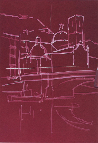
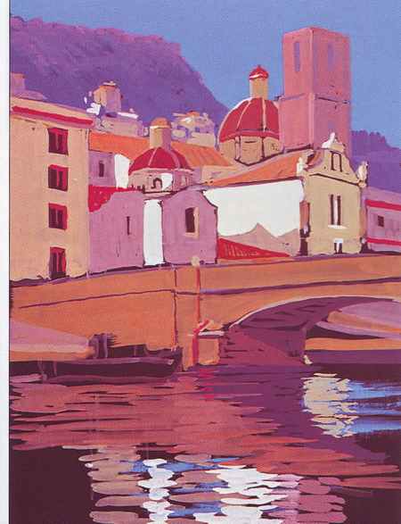
This sea view I wrote from a photograph depicting the town of Bosa on the island of Sardinia, and for my composition I took not the whole picture, but only a fragment that seems to me the most successful.
For work, prepare the following materials:
- Dark burgundy cardboard, 295 x 420 millimeters.
- Gouache of such colors: whitewash, turquoise, azure, ultramarine blue, fuchsin, golden yellow, Neapolitan yellow, dark yellow, lemon yellow, burnt sienna, fiery red.
- Round brushes - No. 10 and 12.
- Flat brush, like a flute - 2.5 cm.
- And a little strip of watercolor paper, about the size of noodles.
So let's get down to painting the landscape
After choosing a photo with a pretty look, I cropped out a really nice piece that would fit well on the canvas. Take a close look at the photo: the selected composition is highlighted on it and a scale grid is applied. This auxiliary grid will help us to proportionally and with magnification transfer the image of the city onto paper.

Gouache painting lesson of the Mediterranean landscape. Choosing a scenic view.
For those completely new to painting, these squares will help you paint a picture, moving alternately from one rectangle to another. Apply the mesh with heavily thinned paint or pencil so you don't have to worry about it showing through the drawing later. It will gradually disappear by itself under a layer of paint during work.
- REFERENCE:
Sardinia is the second largest island in the Mediterranean. It is an autonomous region of Italy. Situated
between Sicily and Corsica
west of the Apennine Peninsula.
Step 1
Pick up a convenient brush (for example, No. 12) and transfer the sketch of the drawing onto the cardboard with white, diluted to a translucent state.
Step 2
Let's start with the sky. Take our main flat brush and mix on the palette blue color from such paints: azure, white and ultramarine. Do not make the paint too thick, it should be applied in an even thin layer. But still, it should remain opaque and completely cover the color of the cardboard so that it does not shine through.
Since the sky is reflected in the water, then a few blue highlights should be thrown down the picture. It is too early to paint over all the water. It will not be completely blue, because it will reflect the city: houses, a bridge and a boat. Therefore, take a close look at the sketch and apply blue stripes to the water in areas where there are no reflections of objects.
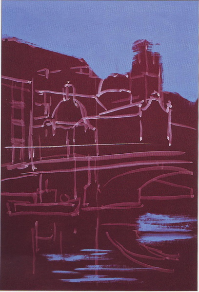
Remember that paints are thick and opaque. Therefore, it is absolutely not scary if you, drawing the sky and distant backgrounds, go to the contours of buildings. Then paint over with a new layer of the paint you need.
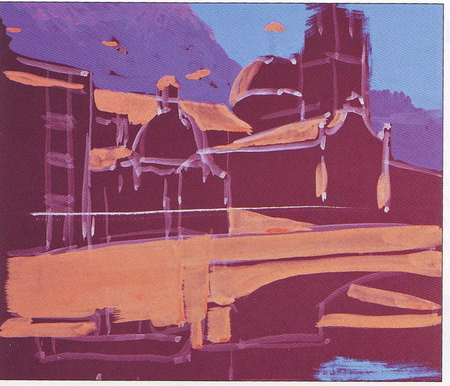
Step 3
We continue to paint the distant background, lower it below the sky and draw hills in the distance. For this, a purple-gray color is suitable. To get it, you need to combine Neapolitan yellow paint and magenta. Use a brush number 10, place the strokes so that they correspond to the outlines of the hills, to continue their natural lines.
Note that the hills are not uniform in color. It is not just a gray spot against the sky. Their tops are more illuminated, and the darkness deepens from top to bottom. To depict this effect, accentuate the highlights on the hilltops. To obtain the desired lighter shade, mix a little fuchsin with the whitewash.

Step 4
And for the outlines of roofs and domes, mix golden yellow, magenta and Neapolitan yellow. Our bridge is a little darker, for it we need to add a little burnt sienna to the resulting color. Use a wide, flat brush to paint the rough outline of the bridge. Especially do not stand on ceremony and in that place, there should be a boat. Then draw it right on top of the bridge.
Step 5
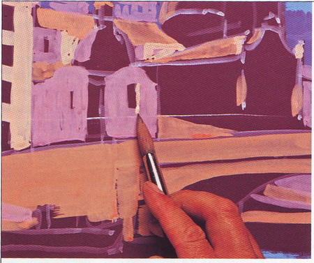
Let's take care of buildings and houses closely. First, paint over all the walls and planes that are in the shadow. For this it is more convenient to use a round brush number 10. Mix the desired color: Neapolitan yellow + magenta + sky blue. This time we use a new drawing technique: dilute the paint with water to such an extent that it becomes translucent. Let the color of the paper shine through it. Take a close look at the sample: some architectural details, like the windows, do not need to be painted over. We will use the paper color for the accents.
Now sketch the houses on the slope of the distant hill in the same color. Subsequently, when you paint the second wall of the house, you will need to make the tone more sunny by adding a little Neapolitan yellow to this paint.
Step 6
We continue to paint at home. These will now be foregrounds with illuminated walls of houses. We need such a mixture: whitewash + Neapolitan yellow + burnt sienna pea. There is no need to paint over the details of the buildings. Unpainted areas will stand out due to the dark color of the paper.
Houses are reflected in the water. Apply with horizontal short and slightly uneven strokes of light paint (with which the walls were painted), focusing on your sketch, where the reflections should be. There is no need to detail reflections or to achieve similarities with buildings. No, just jerky glare on the water.

Step 7
Now we need to mix the main brick-red color, with which we will paint not only such colorful red roofs, but also many details. Such as window frames, architectural elements, and with them we highlight the tiles here and there. Mix the desired red shade from fiery red and Neapolitan yellow. Try to keep the shade not orange, but still remain in the red range.
The resulting basic red color for our roofs in some places needs to be enriched with shades and revived. Specifically on the domes, you need to add a little bit of heavenly blue paint and burnt sienna. And for shadows or darkened areas, mix a little magenta into the base red paint.
According to the laws of aerial perspective, the near dome will be brighter and richer in color than the distant one. And the distant one should be lighter and more muted in color. Therefore, the distant dome should be slightly whitened with white.
Let's pay special attention to the large tower. It has two sides: illuminated and shadowed. To paint its light wall, add a little more Neapolitan yellow and white to the paint mixture. For the shade, on the contrary, the existing shade must be darkened and made colder: add white and a little cold sky blue. In general, the tower is slightly lighter than the rest of the houses. It is higher and better illuminated. So we added whitewash both times.
To paint the shadows cast by the stone rim on the tower, add some more blue paint. In the same tone, darken the side of the wall of the small dome, which is in the shade.
And remember about the reflection in the water: with the same paints we throw separate horizontal short strokes at the place of the reflection of the tower.

Please note: we draw the domes with red segments, leaving the unpainted stripes of the previous layer between them.
Step 8
Glare on buildings is very bright, juicy and contrasting. And in order to write them just as juicy, mix the dark yellow paint with whitewash very thickly - practically without water. And, of course, paint a few strokes with the same color in the reflections on the water.
Step 9
We go down below, draw a bridge. The color needed for the bridge will be: burnt sienna + ultramarine + fuchsin + a drop of white. With the resulting lilac color, write a deep shadow under the arch.
Now add more fiery red to the resulting lilac paint. You will end up with a sunnier shade. We will use them to "highlight" that part of the wall under the arch, on which the sunlight falls. You see, such an elongated triangle right above the water in the arch.
Now we mix in a small amount of ultramarine and draw: 1 - the shadow on the water, which is cast by the bridge; 2 - a piece of the embankment, visible under the arch. (Only we denote it by a strip, it is not necessary to be small in insignificant details).
In order to paintfully and correctly depict the water in the left half of the picture, where the boat is, you need to take the color with which you painted the buildings and muffle it by adding burnt sienna.
Add a few long strokes of the same color to the water surface with which you made the bridge. And let's revive the picture: let's throw a few strokes of magenta on the bridge itself and, accordingly, on its water reflection.

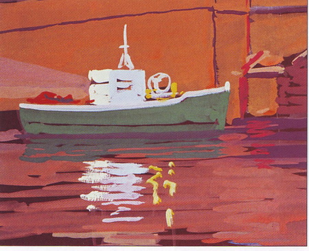
Step 10
Well, finally we got to the boat. Our finishing element in the picture. We will write its body in light green, which will look like this: lemon yellow + turquoise + white. Note that the boat's cockpit is not painted in pure white, but with a mixture of Neapolitan yellow and white. Accordingly, its reflection in the water too. And its shaded edge is a little bluish.
The reflection of the green boat will be slightly darker than the boat itself. Add burnt sienna and azure to the green hull paint and reflect directly under the boat. To prevent them from merging with each other, mark the conditional dividing line with a dark blue-green tint. To get it, you need to mix ultramarine with the green paint with which you made the hull of the boat.
And sketch out a few more bright details (and their reflections) on the boat: somewhere in bright yellow, and somewhere in red-orange.
Step 11
On the left we have buildings that should also somehow be reflected in the water. Moreover, they have dark windows. Again, with short strokes, like all our water, we paint the reflection in the same color that we used to paint at home. In those places where there are windows near the houses, leave unpainted gaps in the reflection too.
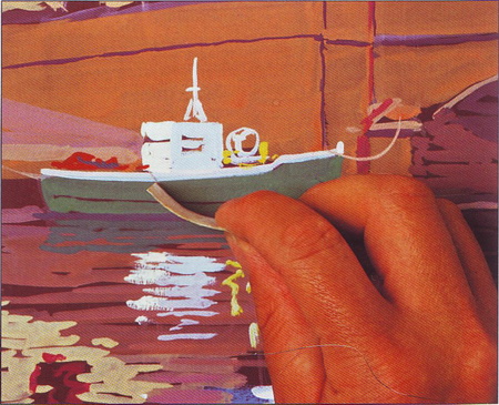
Step 12
The final touch: we bring our boat to life. It remains only to depict the ropes with which it is moored. We don't need any additional thin brushes for this. We use a very simple, but also very interesting painting technique, which later you can use more than once in other works. This technique must be done quickly enough, until the gouache on the boat is dry. We take a thin strip of watercolor paper (here it came in handy for us. And you probably wondered: why it was prepared from the very beginning). ... So, we take a strip of watercolor paper, slightly moisten it with water, and draw strips of ropes with it on the wet paint, moving and stretching it. For convenience, you can bend the strip with varying strength.
There is no particular need to observe the utmost precision when painting this picture. It is intended to convey the hot atmosphere of an exotic Mediterranean island, rather than a photographic view of architectural structures.
Gouache, a French term for a visual technique, was in its prime in painting. It originated in the 4th and 5th centuries. It can be compared to watercolor and oil, since it has common features with both the first and the second: like watercolor, gouache dissolves in water, is applied with the same types of brushes on the same paper; like oil painting, it is opaque and the painted surface can be rewritten in a different color many times.
The gouache technique allows you to make corrections and corrections, multilayer writing is allowed, the use of white in paint mixtures. It should be remembered that gouache paints become very lighter when dry. White gouache and black paint are used in graphic sketches. Gouache colors are bold and opaque, and this makes it possible to superimpose light tones on top of dark tones. However, when dissolved in water, they can produce a watercolor-like effect. Gouache dries rather quickly, and as it dries, the color becomes less saturated and more matte.
Gouache paints mainly consist of the same components as watercolors: colored powder on a vegetable, animal or mineral basis, mixed and bonded with water-soluble resins with the addition of jelly elements.
Gouache techniques:
1. Gouache can be applied to paper in thin, delicate, translucent layers using the wet-on-wet technique, or evenly overlaid on top of each other.
2. It is most convenient to start working with gouache with drawing a sketch. Gouache also has good hiding properties and it can be applied one opaque layer on top of another, the sketch lines should not be too thick and dark - layers of light colors cannot completely paint over them.
3. The drawing for gouache can be made in contrast, you can outline shadows and halftones; thick paint will cover it all.
4. Work with gouache with bristle and kolinkovy brushes. They begin to write the work with dark tones, in order to finish the semitones with whitewash. They write in gouache quickly, until the paint has dried, while it is mobile, using various techniques. So, applying the paint in different ways, sometimes in a thick, sometimes in a blurred layer, they achieve a varied texture of the surface of the work, and at the same time special expressiveness. All corrections and the brightest places in the work are done after the gouache has already dried. Often the method is used when gouache is applied to dry paper, rubbing it with a bristle brush. You can invent other techniques, there can be many of them in gouache. The work itself, the very motive prompts one way or another to solve the work.
5. The hiding power of gouache varies slightly from tone to tone. So, yellow paint has a lower hiding power compared to blue, so the blue base will be visible even through several layers of yellow paint. To enhance the hiding power, white gouaches can be added to a paint with a low indicator. This method increases its hiding power, but has a negative effect on the brightness of the paint color.
6. Working with a brush when painting with gouache requires attention, first of all, to the amount of paint drawn by the brush. To avoid too thick strokes, the brush pile should not be immersed entirely in the paint, it is better - by two-thirds of its length, and it is better to wipe off the excess from the brush on the edge of the palette. If, nevertheless, too much paint gets on the paper, it is worth removing the excess with the same brush, without bringing the paint layer to dry.
7. It is important to wipe the brushes thoroughly when changing color or shade, squeezing the nap against the walls and bottom of a glass of water. In the event of a cardinal color change, so that the remnants of the previous paint do not contaminate the smear, it is worth wiping off the pile with a cloth.
You can also find information of interest in the scientific search engine Otvety.Online. Use the search form:
More on topic 34. Gouache as an artistic technique. Techniques for working with gouache paints .:
- 33. Watercolor as an artistic technique. Techniques for working with watercolors.
- 26. The verb as a part of speech, categories and forms of the verb. Conditions and techniques for studying the verb in elementary school. Organization of extracurricular educational work. The teacher as a subject of pedagogical activity.
- 33. Legal technique: concept, means, techniques, rules.
- 19. Artistic style as a stable system of principles of aesthetic thinking and figurative expression. Constructive-formal structures as the basis of the architectural style (give examples).
Consultation for parents "Traveling in gouache"
Ignatova Irina Vladimirovna, a teacher of fine arts, MOU "Secondary School No. 1", Rtishchevo, Saratov region.Material description: I propose to get acquainted with gouache paints; study the main characteristics of the paint; get acquainted with tools and accessories when working with gouache; explore several practical advice; to discover an artist and a real creator in oneself, both for an adult and a child.
Goals and objectives:
1. To acquaint with the properties of gouache paints.
2. To study the basics of the theory and practice of painting with gouache paints.
3. To give an elementary understanding of the laws of color science.
Children's story artistic creation relatively small. But in a short time, she was able to fill with a number of achievements: these are children's contests, festivals, holidays. Observation and study of this phenomenon helped to scientifically generalize and systematize children's creativity. Studies by educational scientists have proven that children who practice art learn much better. Than their peers. As a result, a number of programs for the development of creative abilities in children have been developed all over the world.
Research results have revealed a fairly definite trend. Abilities are most clearly manifested in adult artists. And the second were children of six years old, almost always ahead of older children, as well as adults not associated with art.
With the period of growing up, a lot changes in a child's life. But he still loves to draw. Perhaps children do it not as freely and not as often as they would like. But always with pleasure.
Why do you think children love to draw and sometimes start doing it before they speak? Probably because drawing is accessible, cognitive, sensual, expressive, it forms a finished product - drawing.
Therefore, we have a responsible task - to support and develop in children not just creativity, but holistic artistic-figurative thinking, without the full development of which logical thinking cannot fully develop and form. And therefore, I offer you joint training in drawing with gouache paints. And my advice on working with gouache will help with this.
Gouache is an unusually beautiful, juicy and thick paint. With gouache, you can overlap areas you don't like and paint new ones on them. This paint fascinates with its strength and richness of color shades. A child of any age (both a boy and a girl) will find mutual understanding with this material.
Gouache is a glue paint. Its pictorial properties are based, first of all, on the fact that it is a covering, i.e. almost opaque. This is its main difference from watercolors, tempera and oil paints. This property is associated with a significant amount (in relation to the content of the binder) pigment and filler. In addition, for greater hiding power, many gouache paints contain whitewash (lead, zinc, titanium), which makes the dried paint somewhat whitish and at the same time gives it a matte and velvety appearance.
Main characteristics
There are two types of gouache: art and poster. The first is intended mainly for easel painting, the second is for decoration work. Gouache paints are beautiful, bright and dissolve well in water.
A smear of gouache dries quickly, so the "traces" of the brush in painting become very obvious, especially in large works. You can avoid the "stripes" effect. Lightly brush over the already dried paint with a damp brush.
Lightfastness
Domestic paints are divided into three groups:
1. "quite lightfast" denoted by three black asterisks;
2. “Moderately persistent”, indicated by two black asterisks;
3. "poorly lightfast", indicated by a single asterisk.
Foundations and primers.
Better to take a solid foundation: quality cardboard. Watercolor cardboard, canvas on cardboard, as well as wooden boards. It is more expedient to use bases that have some texture. Although these paints hold reliably even on smooth surfaces.
Tools and accessories.
Tools as for watercolor painting: brushes, palettes, etc. for work you will need a container with water: for washing and for moistening brushes when mixing paints.
Getting started.
Drawing, as a rule, is done with a medium on the basis of a pencil of medium hardness. There are no special requirements for drawing "under gouache", since gouache is a covering paint that allows you to correct all the errors of the drawing and make any amendments to it. A beginner artist can use this property of gouache to advantage by making either elaborate drawings that can be generalized in the painting process, or in other cases, performing a preliminary drawing only in the most general terms, in order to then transfer most of the work on the drawing into painting.
When working with gouache, you can use most of the existing techniques used in watercolor or acrylic. To create texture, you can use a palette knife, sponge, napkins, pieces of fabric. In addition, paint can be scraped off the surface of the substrate, sandpaper off areas to be reworked, or removed with a bristle brush.
Mixing paints and technological features.
It should be remembered that mixing any whites with other colors will inevitably reduce the brightness of the color.
And also, when it dries, it changes significantly, brightens or darkens, depending on the color of the paint. In this case, unbleached colors change less than bleached ones. To cope with this inconvenience of gouache will help you, firstly, practice, and secondly, the use of colors, i.e. flowers diluted in advance and tried to dry. And also, mixing them with each other, you get the necessary intermediate colors. How to properly learn to mix colors with gouache? From color science, we know that there are 3 primary colors - yellow, red and blue, of which all other colors are composed. We can get the rest of the colors from 3 colors using the example of the color wheel. I suggest doing an exercise on mixing colors and tonal stretches.
Color circle:
1. Color mixing exercise: take 3 primary colors - yellow, red and blue. First we get additional colors: yellow + red = orange, blue + yellow = green, red + blue = purple. Then we mix them together, getting intermediate colors: yellow-orange, orange-red, red-feolet, feolet blue, blue-green, green-yellow.
2. Exercise on darkening and whitening colors: we will work first on whitening the color (adding white to the main color), then on darkening, adding black paint to the main color.
To teach children to mix colors younger age you can draw a rainbow instead of a color wheel. In addition, this work will help to remember the name of the flowers, and for this we recall the artist's playful song: "Every hunter wants to know where the pheasant is sitting." For this task, children use only the basic colors - yellow, blue and red, and all other colors are obtained by mixing paint.
Gouache has good hiding power. By applying paint with strokes, you can overlap the first stroke with the next one almost completely.
It is best to dilute gouache with water to the state of liquid sour cream, apply - as thin as possible. It is best to inscribe one color into another when the latter is still wet (but not wet), or to make registration on a completely dry layer. You should not rub the same place with a brush to blur the previously placed color. Remember that gouache should not collect on the surface in a puddle: such a puddle, when it dries, gives a stain that can no longer be covered or shaded. It can be removed with a knife or scalpel. Pre-moistening this place. And only after drying, they overlap it again. Gouache applied too thick gives glue spots, glitters or may not adhere. Therefore, corrections should be made again, mainly after washing off or removing the paint with a scalpel.
Work on the landscape.
Gouache for me is a material with the broadest possibilities - from the most delicate water-based, watercolor painting to corpus brushstroke.
Of course, gouache also differs from watercolor, oil, tempera, although it has a lot in common with the latter. Gouache is a matte, velvety surface that is noble in every respect. I start my gouache works easily in watercolor technique. But, I go further, and pass on to a more corpus, brushwork, akin to oil painting. A thin glazing letter is applied in gouache initially, and not at the end. This is one of the differences of this material from others.
You can work with gouache and as a pastel or pencil. Revealing the image with small strokes. So, we have determined that gouache can be used as watercolors, oils, pastels, etc., but there are some qualities inherent only to this material. First, you cannot write from beginning to end with glazes, but only at the beginning. Subsequently, the letter turns into densely laid dabs of paint. It is undesirable to cover the body strokes liquidly, as in watercolor, in order to avoid the appearance of dirt. Secondly, gouache is good when it resembles a Florentine mosaic, that is, it preserves the purity and resonance of colors. It is this language that is most characteristic and acceptable for gouache.
Craftsmen and children work with gouache - in the same plane of creative freedom - quickly, in one breath. Children immediately, without underpainting and long reasoning, take and mold the image. Gouache dries quickly.
A few more practical tips.
1. It is not recommended to paint with gouache pasty, as a thick layer of paint will inevitably crack and then crumble.
2. Gouache paintings, painted on canvas, can be fixed with varnish, but it must be remembered that under it the colors change greatly in color. I have done these experiments many times with interesting results.
3. It is necessary to store gouache, like other painting in diffused light and normal room humidity.
Gouache paints help children react with unpleasant emotions (anger, aggression) and translate them into creativity, creating "magic" drawings. Working with gouache for the little ones is an opportunity to dip and play, and for the older ones - to feel strength and confidence in themselves. Not only every child, but even an adult will discover this magical world of gouache paints.
Our kids are taking their first steps in the big world. Each of them will leave its own unique mark, open its own world. And what this trace will be depends on us.
Scientists compare the unified work of the brain with an orchestra, where the right hemisphere is the musicians, and the left is the conductor. The more musicians (vivid and beautiful impressions, experiences, poetic experience, independence) and the more qualified they are, the easier it is for the conductor (left hemisphere) to control them and the more complex a piece can be performed.
Send your good work in the knowledge base is simple. Use the form below
Students, graduate students, young scientists who use the knowledge base in their studies and work will be very grateful to you.
Posted on http://allbest.ru
Introduction
Introduction
The topic of the course project is "The decorative solution of the human figure in a modern suit, in warm colors"
Relevance:
The relevance of the chosen topic lies in the fact that the technique of performing work in gouache is very relevant in our modern world since most of us are used to treating gouache somewhat dismissively. It is believed that this material is suitable only for decoration work and children's creativity, and it is impossible to consider it as a serious material for painting. Gouache is a versatile artistic material that allows you to master artistic techniques common to other materials with paints, water and paper.
You can paint with highly diluted gouache using the watercolor technique, or you can master the writing techniques characteristic of noble oil. Drawing with gouache is comfortable, it does not have an unpleasant odor, does not require working with solvents, makes it easy to make changes to the drawing and does not require any special surface for drawing (canvases, primers, etc.).
The purpose term paper is an:
· Desire to create a decorative painting using expressive means of gouache in painting;
Create creative work, achieve plastic and color solution;
Show female beauty and sophistication, consider the human figure as a genre and understand the intricacies and basic laws of the art of depicting things in the technique of gouache in painting.
· Create the main stages of work on a human figure (compositional searches, sketches from life, sketch, preparatory drawing, solution of a large form, color solution, modeling and modeling of the form, generalization).
Coursework objectives:
· Study the advanced experience of leading, artists of the country and other countries on the topic of coursework;
· To analyze creative works or reproductions of masters, analyze technical and pictorial techniques for creating their own paintings and develop recommendations for its improvement in terms of conceptual and coloristic solutions of the environment and objects;
· To develop and implement (in sketches and color foreskits) the concept of a painting.
Design object:
The human figure in the modern world. Gouache.
In ideas about beautiful woman in the modern world, from the point of view of her height and weight, characteristics are most often present (average height, "not thin - not full", proportional figure, slim).
1. Research section
1.1 Fundamentals of color composition
Composition (from Latin compositio - compilation, composition), construction of a work of art, due to its content, nature and purpose and largely determines its perception. Composition is the most important organizing component of a work of art, giving it integrity, subordinating its elements to each other and to the whole.
The work is built on the subordination of all the less significant elements of the construction with the main plot-thematic center. Subject-semantic elements of the composition are invariably promoted by special expressive means: lighting, tonality, color, point and moment of shooting, plan, foreshortening, as well as pictorial accent and various contrasts. The composition should not play an independent role. Just as speech has the meaning of a transmitter of thought, composition serves only as a means for expressing the author's thought. "There are an infinite number of potentially satisfying combinations. But none of them is the only correct aesthetically. Although some may seem better than others" (V. Papanek)
The science of composition studies the general internal patterns of the structure of forms in art and design, as well as specific means of achieving their integrity and unity with the content of things. Composing in color means placing two or more colors side by side in such a way that their combination is extremely expressive. For the general solution of the color composition, the choice of colors, their relationship to each other, their place and direction within a given composition, configuration of forms, simultaneous connections, sizes of color areas and contrasting relationships in general are important. The theme of the color composition is so diverse that it is possible to reflect only some of its main points. In the section on color consonances, we have already talked about the possibilities of creating a harmonious composition.
In considering the expressive properties of color, we established the necessary specific conditions and relationships that could reveal in each color its characteristic expressiveness. The nature and effect of a color is determined by its location in relation to its accompanying colors. Color is never alone, it is always perceived in the environment of other colors.
The further along the color wheel one color is removed from another, the more they contrast with each other. However, the value and meaning of each color in a painting is determined not only by the surrounding colors. The quality and dimensions of the color planes are also extremely important for the impression produced by a particular color.
Color spectrum is a series of harmoniously interrelated shades of color used in the creation of works of art.
Warm colors- This is the gamut of using colors with a warm shade. The hottest color is orange. The most "cold" -blue, always associated with cool water and ice Passing from blue through green and yellow tones, the colors warm up, keep the "high temperature" on red, burgundy, brown and some shades of pink and purple, and then "go down" again to the cold through the lilac and blue.
However, the presented gradation is very arbitrary, since the boundaries between cold and warm are barely perceptible. For example, lime is more of a yellow shade, but is a cool color. Conversely, deep, rich purple can be either warm or cold, depending on whether it is dominated by red or blue.
1.2 Principles of writing a decorative composition
Composition in fine arts connected with the need to convey the main idea, the idea of the work in the most clear and convincing way. The main thing in composition is the creation of an artistic image. Pictures painted in different eras, in completely different styles, amaze our imagination and are remembered for a long time, largely due to their clear compositional structure. Indeed, if you try in the paintings of P. Bruegel the Elder "Hunters in the Snow", P. Gauguin "Bonjour, Monsieur Gauguin" and V. Surikov "Boyarynya Morozova" something to change, for example, the size of the canvas, the ratio of dark and light spots, the number figures, the height of the horizon line, etc., the integrity of the composition is immediately destroyed, the balance of the parts is lost.
It is no coincidence that as examples, it was proposed to consider such works, which are so different in their pictorial manner. The inability to make changes to the finished picture confirms the force of the laws and rules of composition
A common technique for constructing a composition for conveying events taking place at different times and in different places is to combine several plots into one whole. Typically, this is a large-sized image in the center of the canvas and small drawings around it. Examples of such a construction of a composition can be found in icon painting, folk art, book graphics and other types of art.
Compositional techniques are fully dependent on the types of art. Along with the general laws of composition, each type of art has its own specifics and even the same compositional means can be used in different ways.
In a work of painting, the composition should seem natural and organic, not to impose the idea of the painting on the viewer, but as if imperceptibly to bring him to it so that he imbued with its content and the artist's intention.
In painting, composition helps to convey the illusion of space, its depth.
The property of a decorative composition is a decorative transformation of any nature, highlighting the elegance, colorfulness, ornamentation of the surrounding world, compliance with a certain measure of conventionality of the image. Skillful generalization of the form does not in the least harm expressiveness. The rejection of minor details makes the main thing more visible. Not only a strict selection of the main thing leads to positive results, but also some understatement, associativity of the emotional-figurative solution of the topic.
Artists use composition as a universal means to create a painting, sculpture or work of decorative and applied art, to achieve their figurative and emotional expressiveness. Composition is not only a thought, an idea of a work, for the sake of expression of which the artist takes up a brush and pencil, it is also a plastic form of expression that is definitely consonant with the artist's soul and the requirements of the time.
2. Manufacturing technology of creative work
2.1 Technique of the design part
artistic painting watercolor gouache
Gouache painting technique was performed using watercolor techniques. At the same time, the surface of the paper was covered densely and dullly.
Do not dip the brush directly into the jar containing the gouache paint. I spread small portions of each paint with a wooden spatula on the palette and there, adding the required amount of water, mix to obtain the desired color.
She used few paints, avoiding complex mixtures, multiple overlapping of some colors with others, and achieved high color expressiveness.
2.2 Justification for the choice of materials, equipment, tools, fixtures, textures for the implementation of a painting project
Guamsh (fr. Gouache, ital. Guazzo water paint, splash) is a type of adhesive water-soluble paints, more dense and matte than watercolor.
Gouache paints are made from pigments and glue with the addition of white. The admixture of white gives the gouache a matte velvety texture, but when it dries, the colors whiten (lighten) a little, which the artist should take into account when drawing. With the help of gouache paints, you can overlap dark tones with light ones. A dry gouache image is slightly lighter than a wet image, making color matching difficult. The ink layer can also be prone to cracking if applied too thickly. This problem can be alleviated to a certain extent by using a thickening base such as aquapasto or by adding a small amount of wood glue to the paints.
Fluorescent gouache paints are produced for decorative work and stage performances. These inks have the ability to fluoresce when exposed to ultraviolet and visible violet, blue and green rays. Fluorescent gouache has the property of increasing its brightness when irradiated, which is used for decorative effects in the dark. Gouache fluorescent paints are diluted with water. These paints have a low hiding power, therefore it is recommended to apply them on a white substrate - white primer, paper, etc., which makes them brighter, and the paints should be applied in a thin layer. Fluorescent gouache is not waterproof and therefore not recommended for outdoor use.
· Pros and cons of gouache Gouache is a water-soluble, opaque paint), has the following advantages: it is easily restored by stirring and water, it also regulates the "density" of the paint quickly dries almost odorless, you can not erase the sketch, you can overlap one layer with another, you can then mix errors, you can correct them. Cons: - a very thick layer of paint will crack and crumble - brushes must be thoroughly washed - a combination of a brush and "density" can darken the process of painting with gouache.
Gouache was used by famous old masters - Rubens, Van Dyck, Durer. Later, Picasso, Burne-Jones, Egon Schiele, Henry Moore also showed great interest in her.
2.3 Project progress description
What you need: Paper. The surface for drawing must absorb water, then the paint will adhere well to the surface, the layer will be even, after drying it will not crumble. Whatman size A2 is best suited. Brushes. Brushes will also need different - both flat and with "thin tips", sizes - depending on the scale of work. The larger the area, the larger the brush should be, it is more comfortable and remains faster - A stiff bristle brush can be used if a specific stroke is required. It is not recommended to use very soft brushes, since gouache is a heavy paint, it will be unevenly given by such a brush, the brush will not restore its shape well. Palette
The palette should be prepared before work, with a systematic placement of paints in a certain low-lying order. I worked like this.
Paints are placed along the top edge of the palette. In the center are whitewash, on the right are warm, and on the left are cold colors, in order to avoid the formation of a dirty color, I mixed colors only with the nearest colors on the palette, or with white. The main scheme of work is as follows, halftones are blue, and light places are yellow, regardless of what color the object is, it should be conveyed in the context of the entire composition, with the variety of colors that I have on the palette. It is best to lay out paints closer to the outer edge of the palette, so there is more room to work with colors.
· A container with water.
· Pencil
· Soft eraser, a cloth for wiping the brush, a tablet for fixing a sheet of cardboard.
· Gouache.
Posted on Allbest.ru
...Similar documents
History and features of crochet. Features of the selection of colors from the point of view of psychology. Justification of the choice of materials, tools, the choice of a pattern of drawing and a model for knitting. Model manufacturing sequence technique. Safety precautions.
practical work, added 03/13/2010
The emergence and development of the author's postcards. Cats in the history of painting. The process of creating miniature compositions in the form of postcards. Technique for sketching, sketching. Techniques for working with gouache. Technological feature of the paint. Features of the construction of the landscape.
term paper added 01/20/2015
The technique of making a pictorial image from nature. Basic concepts of realistic painting. The artist's palette and methods of working with it. Mixing oil paints, methods of applying to canvas. The sequence of work in the genre of still life.
term paper added 03/18/2014
The history of print - a section of easel graphics. Development of the art of illustration. Features of the development of a sketch composition for a cut engraving. Stages of performing gouache color painting based on a tonal sketch. Description of graphic sheets, their format.
test, added 01/28/2014
Portrait as a genre in painting. The history of portrait painting. Portrait in Russian painting. Building the composition of the portrait. Oil painting technique. The basis for painting. Oil art paints and brushes. Color palette and paint mixing.
thesis, added 05/25/2015
The palette is like a small thin and light board on which the artist mixes paints. Description of several varieties of watercolors, tempera, oil and acrylic paints, gouache. Dry craft material. Pencils and pastels. Plasticine and modeling mass
presentation added on 10/20/2013
Definition of the components of the kitchen kit, their characteristics and functional features: curtains, tablecloths, napkins and an apron. The principles of selection of colors and shapes of curtains and other elements depending on the size and type of kitchen space.
abstract added 01/24/2013
Definition of the concept and history of the development of the cafe. Investigation of the features of the fusion style. Description of the volumetric-spatial composition of this cafe. Choice of room colors, ecological furniture and accessories. Ergonomics rules in interior design.
thesis, added 07/27/2015
Consideration of the structural features of the collection of men's suits for showmen using natural materials. Study of the portrait of the consumer; choice of colors, manufacturing technology. Calculation of cost, profit and profitability.
thesis, added 10/26/2014
Creation of a sketch of a decorative panel "Inspiration" in the technique of floristry. Required tools and accessories: scissors, tweezers, brushes, threads, needles, cutters, pruning shears, pencils, rulers and squares, natural materials. Routing project.